iPhone Duo: the folding screen shaking up your UX
Is your website ready for a screen that changes shape while your customer is using it?
3 min read
Published on 24/09/2026 · By Naïm Khalifa, Eazyclick.
On 9 September, Apple unveiled the iPhone Duo, its very first foldable iPhone. It sounds like gadget news. There's more to it. For the first time on an iPhone, the screen in your customer's hand can change size halfway through a visit to your website.

Source: apple.com
Two screens, one habit to rethink
The Duo has a small outer screen of around 5.4 inches and a large inner screen of around 7.6 inches. Apple's advice to developers boils down to one idea: don't design a version for every phone position (closed, open, folded like a book, resting in tabletop mode), but create an interface that can resize itself.
That's the real change. Until now, we thought of "responsive" in screen sizes: phone, tablet, computer. With a moving screen, the question becomes: what happens when the available space changes while someone is doing something? The text they've started typing must stay. So must their place on the page. DesignWhine sums it up by saying responsive design is moving from a sizing problem to a state problem: your product must preserve the person's intent, even when the interface transforms.
The fold: a detail that could cost you sales
Another new consideration: the fold area. Apple recommends keeping buttons, menus and alerts away from it, because a button on the curve is awkward to tap. Scrolling text, on the other hand, can simply flow across. A practical guide from agency Lazige puts it well: a paragraph crossing the fold is fine; a payment button crossing it, much less so.
On the web, there's a catch: Safari can't yet reliably tell you where the fold is, and the tools designed for this remain experimental in September 2026. The current rule: a solid responsive website first, fold detection later, perhaps.
And where does AI fit in?
Two things to distinguish. The fact: Apple used AI in manufacturing the hinge. According to hardware chief Johny Srouji, algorithms pair each hinge with its ideal casing, then a laser scans every part and thin layers are 3D-printed to correct defects. That's AI in the factory, not the interface.
The bet is on the UX side. Some observers believe manually adjusting every screen for every posture is a testing nightmare, and that it will push the industry towards interfaces generated by AI on the fly, adapting themselves to the available space. Bear in mind: that's an opinion, not an Apple announcement. But it raises a real question, and that's where you can form your own view.
Why this matters to you as a small business owner
Your customers won't all buy a foldable iPhone tomorrow. The Duo mainly reveals weaknesses: websites built around fixed sizes, full-screen pop-ups that block everything, huge cookie banners and elements pinned to screen edges. A truly responsive website is already almost ready. An "approximately responsive" one will struggle, on a Duo or any screen that changes.
What you can actually do this week
Stretch your website manually. Open it on a computer and slowly drag the window from very narrow to very wide, without stopping at familiar sizes. Note anything that breaks, overlaps or disappears.
Test your cookie banner and chat on a small screen. If they eat up half the screen and hide your main button (quote, booking, purchase), that's your number one priority.
Check that your key button stays visible and clickable everywhere. Never pinned to an edge using fixed measurements.
Don't ask for an "iPhone Duo version". Ask your developer or agency for blocks that rearrange themselves to suit the space they're given. It's the same thinking as for any screen, done better.
To sum up
The iPhone Duo doesn't mean your website has to become a foldable-specific site. It's a reminder that an interface should adapt to the available space, including when that space changes mid-use. One real question remains open: will we keep designing these adaptations by hand, or will AI eventually generate the interface on the fly?
Want to know whether your website holds up on a screen that moves? At Eazyclick, that's exactly the kind of audit we enjoy doing.
You might also like these articles
-
 Tech
Tech How we turned our haters into customers
Let's be honest: this year, we've racked up several hundred million views on social media. A number that's nice to see, but meaningless on its own. A view doesn't pay the bills.
-
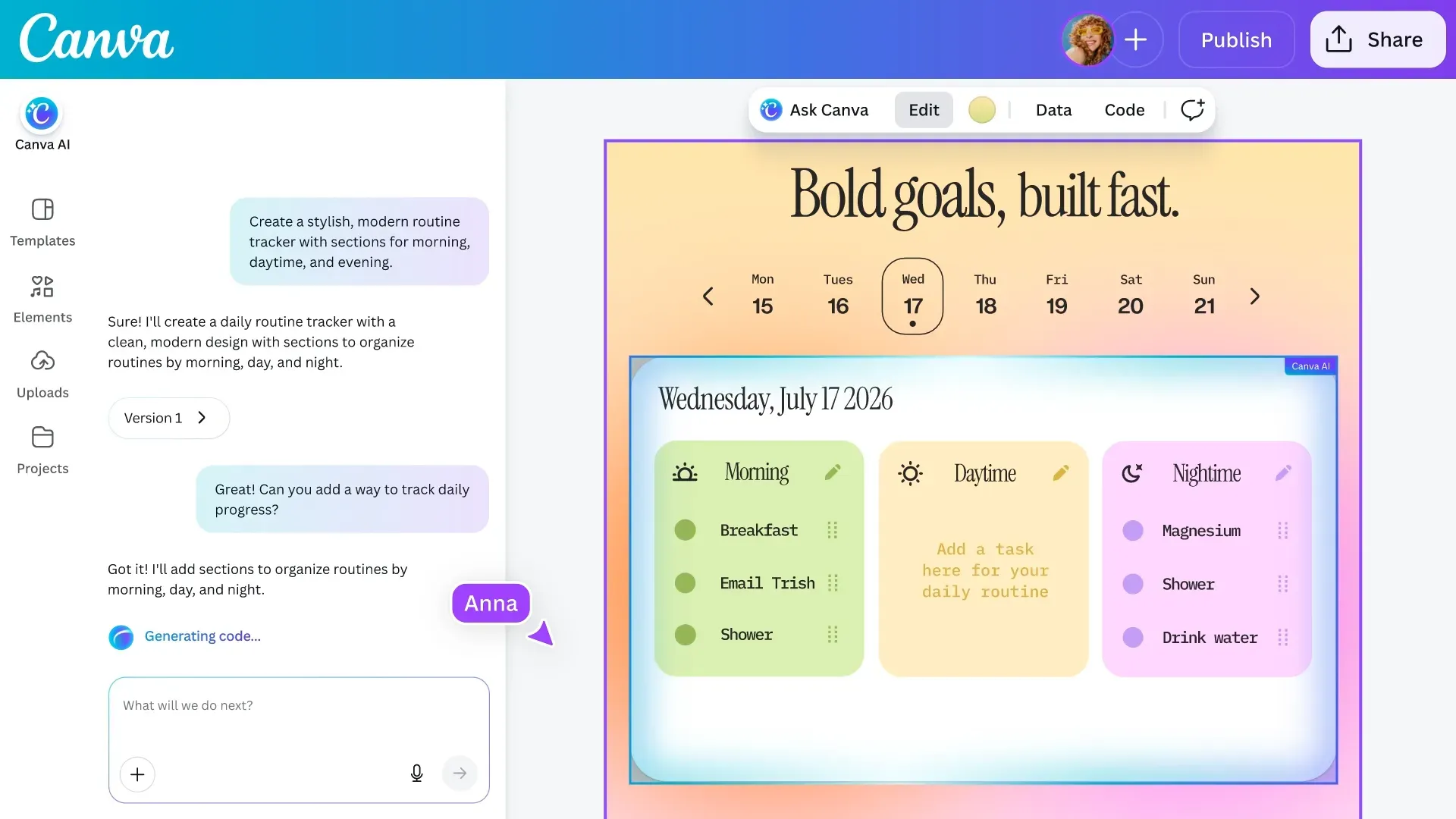
A new arrival in vibe coding: Canva Code 2.0 (not for pros)
A year after launch, Canva Code reaches version 2.0 and opens to all users, including free accounts. The idea: describe the website you want in everyday language and let AI generate it.
-

WR!T3 HUM4N!
A few years ago, a good brand identity meant a clean logo, readable type, consistent guidelines, everything neatly in place. Today, some of the most talked-about identities do the exact opposite.


Useful tips, straight to your inbox
Get the latest Eazyclick tips and join a community that shares, learns and moves forward together.
Thank you!
Your subscription is confirmed. The next tips will reach your inbox soon.

Further reading
- Topic


