Winamp skins: when interfaces refused to be invisible
What if your website could have a real personality?
2 min read
Published on 26/09/2026 · By Federica García, Eazyclick.
For years, you have been told that “the best design is invisible”. Clean, neutral, fading into the background to let the content shine. But before this obsession with restraint, there was a time when the interface demanded attention. And it worked.
The audio player that became a playground
In the 2000s, millions downloaded Winamp to listen to music. Many stayed for an entirely different reason: the ability to transform the software's interface completely. A chrome spaceship, a translucent jellyfish, a manga shrine or an unidentified object that no longer resembled an audio player: thousands of “skins” circulated online, each reflecting a different corner of emerging internet culture. Choosing a skin was a little like choosing a bedroom poster or a concert T-shirt: it said something about you.
Saved just in time by a passionate developer
This heritage nearly vanished when Winamp was acquired in 2014 and the official website and its community disappeared. A developer, Jordan Eldredge, eventually preserved the project's memory by launching the Winamp Skin Museum in partnership with the Internet Archive: more than 100 000 skins now available to explore, with a working version of the player right in your browser. Users have even rediscovered forgotten Easter eggs left in the files by their creators, remnants of a time when the web was still handmade.

Source: skins.webamp.org
Why this matters to you as an SME owner
Platform centralisation gradually erased this personalisation. Personal websites disappeared, profiles became templates and interfaces grew uniform. As a result, most SME websites look alike, because they come from the same builder with the same blocks. The problem is not using a tool such as Shopify or Webflow. It is stopping at the default template, when a little personality is precisely what sets you apart from competitors who have changed nothing.
What you can do this week
Look at your 3 main competitors side by side. If you cannot tell which is which without reading the name, your visual identity is not doing its job.
Choose ONE element and fully commit to it. A striking colour, typography with character, an original illustration instead of a generic stock photo. You do not need to rebuild the whole website to start standing out.
Do not fear “too much”. A well-judged touch of imagination, consistent with your brand, is more memorable than a perfectly clean but interchangeable design.
In summary
The most “professional” interface is not always the most memorable. Winamp proved it in its own way twenty years ago: a little imagination and personality, embraced fully, never hurt a product or a brand.
Want to explore how to give your website more character? At Eazyclick, that is exactly the kind of conversation we enjoy.
You might also like these articles
-
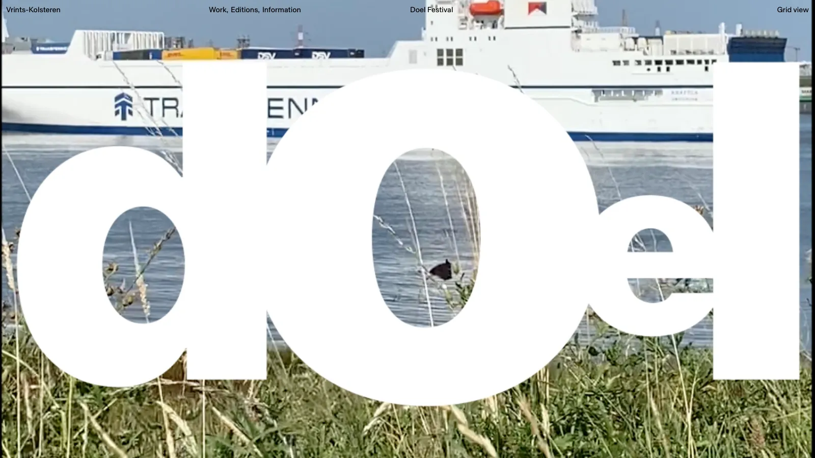
End of summer: Belgium, a country of festivals
Your visuals no longer dress your offering, they ARE your offering
-
Website prices in Belgium (2026)
How much does a website cost in Belgium in 2026? Real prices (freelancers, agencies, subscriptions), what affects your budget and regional grants.
-
 Creation & design
 Anti-design: why imperfection has become brands' new weapon
Pixel-perfect is over. Today's successful brands embrace their imperfections. Here is why, and what it changes for you.


Useful tips, straight to your inbox
Get the latest Eazyclick tips and join a community that shares, learns and moves forward together.
Thank you!
Your subscription is confirmed. The next tips will reach your inbox soon.


